


131: WAB goes mainstream
WAB is now on the Team Sheets presented by the NCAA.

The Division-I Men's Basketball Committee will share its in-season top 16 teams Saturday at 12:30 p.m. ET on CBS. About 10 days ago, Andy Katz hosted a roundtable discussion about the criteria and different metrics used by the selection committee. You can watch or listen to the entire 25 minute conversation, which features Ken Pomeroy, Bart Torvik, Alok Pattani, and others.
The main takeaway from the discussion is that résumé metrics should carry more weight than predictive metrics in the selection process. Enter Wins-Above-Baseline (WAB), a metric that made its debut appearance of the Team Sheets and NET rankings earlier this season.
A refresher on WAB
WAB is a team’s résumé summarized into a single number. I’ve written about WAB a ton in the past. WAB is handy because:
wins and losses matter, not the margin of victory
there are no arbitrary bins (quadrants)
it doesn’t drastically change day-to-day (like NET rankings)
There is a value to each game, and teams gain value in a win and lose value in a loss. The value is based on the odds a team on the bubble would beat an opponent, and these odds factor in the location of the game.
People like Seth Burn have been using WAB for over a decade. It’s a metric that has grown in popularity on the Team Sheets on barttorvik.com. And this season, it’s on the actual NCAA Team Sheets and NET rankings.
NET and WAB
The NCAA's version of WAB differs from other WAB metrics because it’s derived from the current NET rankings. As Pattani explains, the committee did not want priors or preseason rating inputs in the NET. This difference should diminish as we approach Selection Sunday and the sample size grows.
As as aside, I maintain the fatal flaw of the NET is the medium, not the message. There is a lack of transparency in the metrics because there is no actual rating for NET, only the ranking.
The media and fans shout about quadrant records. We don’t need to know a head coach’s record in Q1 games1 the last few seasons to know the team is underperforming. The overall record can do that too.
The NCAA’s insistence to create their own ratings, release them daily without providing full proof of the work is not great.
How can we use WAB?
Because WAB assigns a value to every game, we can use those values to infer how a team builds a résumé.
For example, the table below shows all teams ranked in the top 25 of both NET WAB and Torvik’s WAB through February 13 games2, and the breakdown of conference WAB (orange) and non-conference WAB (blue). Each square denotes an estimated WAB point, and it’s rounded up to the next whole number.

This table shows how teams like Louisville and Arizona have built their résumés primarily through conference play. Both teams own a negative WAB in the non-conference, but have won a ton of games in league play.
The Cardinals are 7-1 on the road in the ACC with a +131 point differential. The Wildcats are 12-1 in the Big 12 and 6-0 away from home. Road wins matter.
While other teams like Oregon and Memphis have put together strong non-conference performances. The Ducks are 6-8 overall in the Big Ten, but own neutral site wins over SEC teams Alabama and Texas A&M.
The Tigers are 10-1 atop the American Conference, but have home wins over SEC teams (Missouri, Ole Miss) and road victories over ACC teams (Clemson, Virginia).
This distinction becomes even more significant when we consider the seasonal distribution of games. The chart shows when those non-conference and conference games are played.
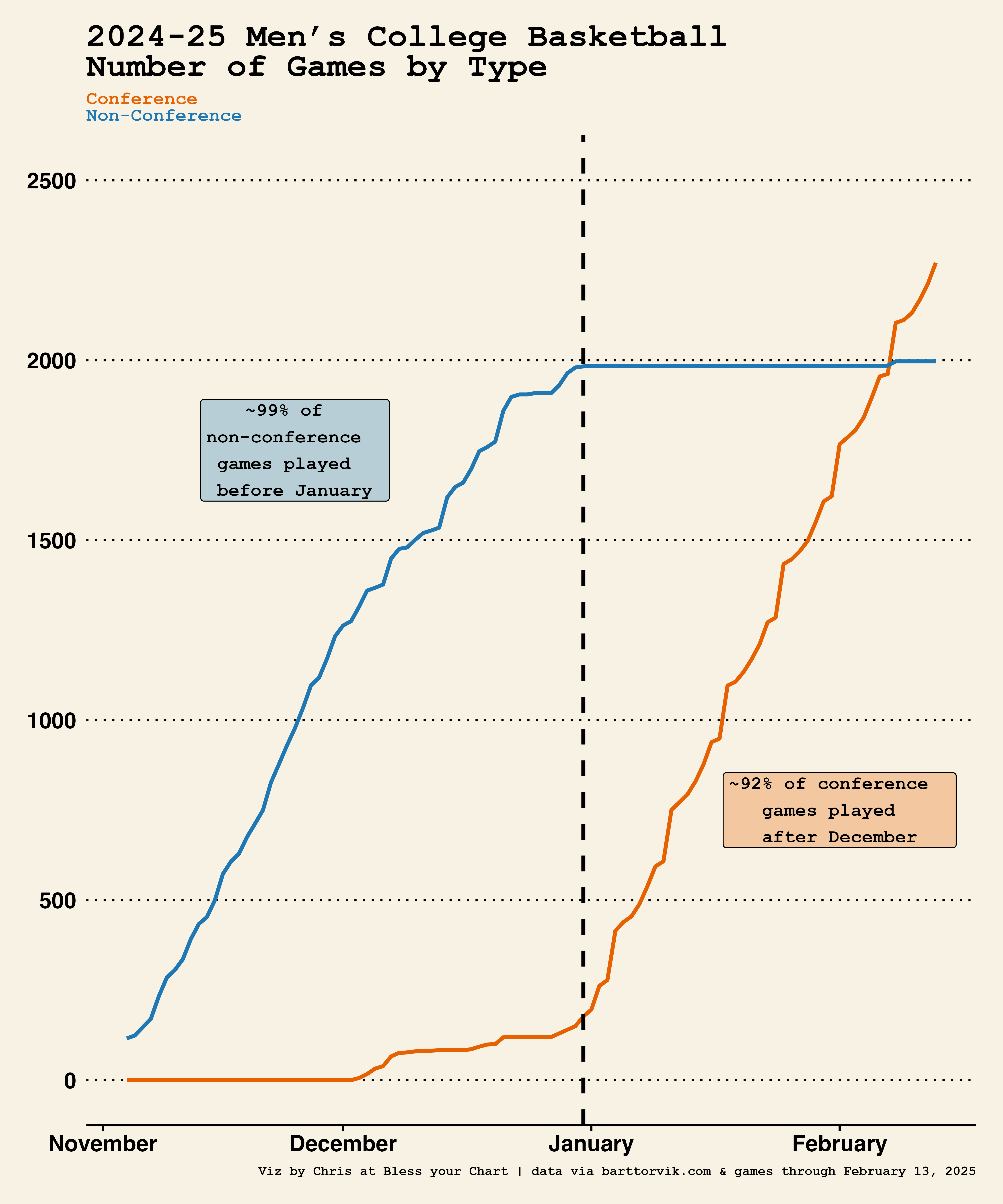
About 99 percent of non-conference games are played before January 1, while around 92 percent of conference games are played after that date.
The leagues these days are bloated. Most of the power leagues no longer play round robin schedules and all league members don’t even qualify for conference tournaments. The scheduling is out of balance and it’s harder than ever to discern if teams are getting better, worse, or it’s simply the strength of the competition.
So what does this mean moving forward?
The addition of WAB on the official Team Sheets is a positive step toward more nuanced team evaluation. I’m skeptical the committee, fans, and media are ready for a nuanced conversation though.
Exhibit A:
ESPN’s Karl Ravech shared this during the Alabama and Texas game earlier this week:
We know how dominant they were in the non-conference season, the SEC. They were 185-23. Since January 4, into Tuesday, the SEC teams are 82-82. It’s not as if one team or two teams or three — they’re 82-82. There’s been no ability pull away, there’s no dominant group of teams.
We know for the chart above, that the SEC is 82-82 because the teams are playing in league play only. The gaffe by Ravech, and the reactions, sort of sums up a lot of the world today.
And it’s something I was reminded reading Benn Stancil’s newsletter last week, specifically this comment on attention, going viral, engagement, and outrage.
What are we doing here?
Anyhow, if you’re wondering where you can find a breakdown of WAB by conference, non-conference, home, away, and neutral games - check out this tiny app.
You can also find conference standings and point differentials, and TRAM, which I wrote about last week. That’s enough self-promotion 🙃
🤟 Happy Friday and opening weekend of college baseball 🤟
Feels like these articles are written by AI. An aggregation masterclass.
The biggest discrepancies between the WAB rankings of teams in the top 50 when comparing Torvik’s WAB and the NET WAB as of today:
Missouri +11 in NET WAB
Kentucky +8 in NET WAB
Arkansas +7 in NET WAB
Oklahoma +6 in NET WAB
Saint Mary’s -6 in NET WAB
New Mexico State -5 in NET WAB
Maybe the NET is overrating the SEC? Full transparency, I’m trying to calculate WAB on my own using Torvik’s data and his WAB metrics as a benchmark. It’s similar, and you can find the code to do so here.